


I've been remiss on my planned series of tips and info. I'll try to make up for falling behind. Since I'm calling myself the Paper Stylist, I'll talk about my favorite material - paper. I'll do my best to debunk and explain some of the terminology surrounding paper. I am by no means an expert, but here is some information I have cultivated through my work experience and the internet. This will be slightly boring, but highly useful information (especially for my clients)
Paper Weight
On packages of paper, you will frequently see a weight written like 28lb., 80lb., 110lb., etc. For paper weight, the "#" symbol means pounds. The weight refers to 500 sheets (a ream) of paper cut to a standard size is its basis weight. When manufacturers refer to standard size (basic size), they don't mean the 8.5 x11 sheets you purchase at Staples or OfficeMax. It isn't the same for all paper types.
BOND (Basic size 17" x 22")
TEXT (Basic size 25" x 38")
COVER (Basic Size 20" x 26")
The easiest rule of thumb is "The higher the weight, the thicker the paper."
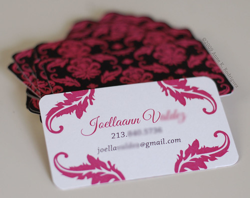
Bond, Text and Cover
Bond or Writing - Bond or writing papers are used for letterhead and must be able to run through office copy machines and laser printers. The most commonly recognized bond or writing stocks are:
- 20# - A standard weight paper, equivalent to 50# text.
- 24# - The preferred weight for most business papers like letterheads, equivalent to 60# text.
- 28# - Heavier paper less frequently used because its thickness can pose problems feeding through laser printers. However, the durability of this stock makes its ideal for outer envelopes.
Text - Also known as book or offset papers, text paper can have a coated or uncoated finish. These thinner, lightweight papers are often used for publication interiors, sell sheets and letterheads. Below is a brief description of some of the most common text weights, from lightest to heaviest:
- 50# - Standard light weight paper, equivalent to 20# bond.
- 60# - One grade heavier than standard, equivalent to 24# bond.
- 70# - Equivalent to 28# bond.
- 80#
- 100#
- 65# - A lightweight, uncoated cover stock.
- 80# - The next weight heavier than 65#.
- 88# - Heavier than 80#, but still considered a lightweight cover paper.
- 100# - Mid-weight cover paper.
- 120# - Sturdy cover paper considered a heavyweight.
- 12 pt. - A heavyweight coated cover alternative.
- Coated - A paper with a waxy finish (shiny or matte) on both sides. This allows ink or toner to better adhere to the paper. This is highly recommended for inkjet paper. A type of coated paper is the photo papers that are readily available at most office supply retailers.
- Uncoated -A paper with an untreated surface that is dull and unreflective.
 Laid - A paper that is manufactured with textured lines on its surface. This finish is used mostly for business stationery elements, like letterhead, envelopes and business cards. Laid is more textured than Linen finish and typically won't print well unless a wet printing process is used. Depending on the printer, laid does not print well with laser printers.
 Linen - Similar to a laid finish, this paper has textured lines on the surface of the sheet, but they are finer and more regular than those that appear on a laid finish stock. This paper is also used frequently for business stationery.
 Stardream - This is a brand of metallic and pearlescent colored papers. The colors range from pastels to jewel-tones. There are other brands of metallic papers such as Petallics and Curious papers. Although, Stardream is starting be used as a general term for any shiny, pearlescent stock. Many retailers will state that Stardream is inkjet-compatible. Do not fall for it. I have yet to meet a person who has successfully printed on stardream with an inkjet printer.