9.17.2008

Wedding Invitation Flashback

To give myself a sense of accomplishment and to make it easy to find my previous invitation designs, here's a rundown of my wedding invitations from the last six months.

1. Wendy and Lior's Wedding Invitation Suite, click here.

2. Aileen and Scott's Wedding Invitation Suite, click here.


3. Daniella & Josue's Invitation Suite, click here.
4. Jenny and Kenny's Invitation Suite, click here.
5. & 6. Janice & JD and Pam & Geoff's Invitation Suites, click here.


To all the couples whose wedding invitations I've worked on in the last 6 months, thanks for giving this designer so many opportunities to explore my creativity.

9.14.2008

Table Numbers & Escort Cards: Jenny & Kenny

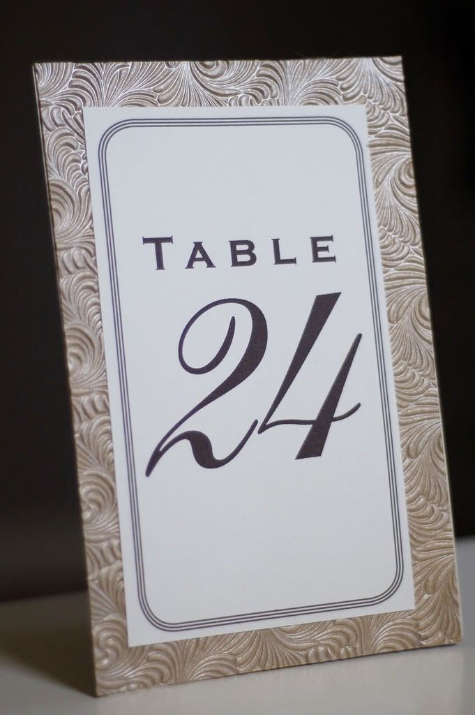
Jenny had fully intended on DIYing her own table number and escort cards. However, an extremely demanding work schedule put a halt to that idea. Because I had designed Jenny and Kenny's invites, she contacted me to help her by designing and assembling these items for her. Her only instructions were that she wanted to do something other than table tents and it had to have some kind of "wow" factor. Otherwise, my imagination had free reign.

I had some textured gold paper leftover from their invites. (I am guilty of constantly ordering far more materials than I actually need.) Here is a sample of the table numbers I created.

For her escort cards, Jenny had toyed with the idea of using little envelopes with each person name on it. The practicality of that was a bit daunting because she needed 155 escort cards! So, I worked with that general idea. Here's what I designed and assembled for her.
Each pochette was attached to ribbons that ran along the width of her escort card table

Close-up of Pochette

Opened with Table Assignment

Thank You Card : Paul & Kelly

Kelly contacted me after finding my blog. She and her fiance had already sent their wedding invitations. So, she couldn't hire me to create that particular item for them. Instead, she decided that she wanted custom Thank You cards. Kelly was very thorough and specific about the look they were going for.

Here some of the images and commentary she gave me for design direction.

We prefer the Japanese Zen feel of something modern and clean but also bold, wispy, romantic and soft. Although a lot of times bamboo is portrayed as big stalks with some pointy leaves, bamboo is really a grass and it has a lot of movement in the wind and is very graceful. Some images that are modern and have a soft wispy feel are also attached to give you some inspiration and ideas hopefully. Our wedding colors are lavender, sage green and some deep purple (bridesmaid dresses and rehearsal dinner invitation).

{Source Unknown}
This is labeled non-preferred bamboo. This is because it reminds me of stereotypical Chinese/Asian/Polynesian bamboo especially with the placement of the double happiness image and all. It has an exotic "oriental" feel.

After a few rounds of correction, this is the finished product.

Thank You Card with matching light green envelope

I hope that Kelly and Paul enjoy writing their thank you notes on these cards. From the sounds of things, they have quite a few to write. They ordered 180 of these bad boys!

9.13.2008

An Introduction


For as long as I can remember, I have had an infatuation with paper. When I was kid, my mom used to bring home stacks and stacks of computer paper. This was the 80s when computer paper came in long perforated stacks. Give me a stack of paper and a new box of crayons and I was a happy camper.
This love affair with paper manifested in high school as fanciful collages made from magazine cutouts and wrapping paper and monumental stacks of black and white photos. In college, I discovered graphic design by way of an artist boyfriend. After that, I switched my major from pre-physical therapy to graphic design much to the chagrin of my parents. The learning process fueled my creativity past college. So, I continued to create things. I made cards, designed handmade books, fashioned origami, and whatever else the mood inspired. My favorite thing to do was custom stationery for friends and family. I made wedding invitations for my friend's wedding and baby announcements for another friend's baby. I did various small projects like this for years. It was something that I did "on the side". Five months ago, my day job quit me. Then, the thing that I did "on the side" became something I simply "did".

This blog is for my creative endeavors . I thought it was about time to separate my creative projects from my personal life. I can't promise that everything I post will be unbelievably incredible. However, I'll do my best to make it interesting.

8.11.2008

Wedding Date Twins

Thursday August 7, 2008

I really have been busy with design work. I have a first. This is the first time I've been asked to design invitations for weddings that are on the same day. These couples are in essence wedding date twins. Their wedding dates are the only thing they have in common. The style and feel of each wedding was radically different from the other. This gave me the opportunity to really flex my "design muscles".

Pam & Geoff
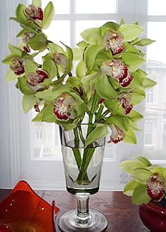
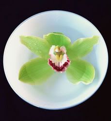
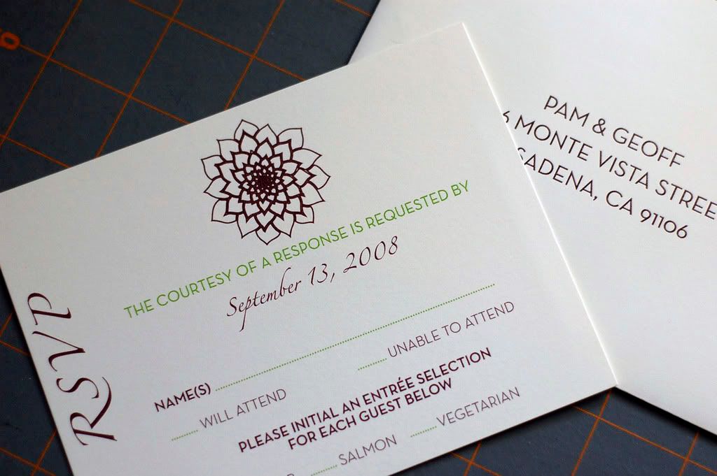
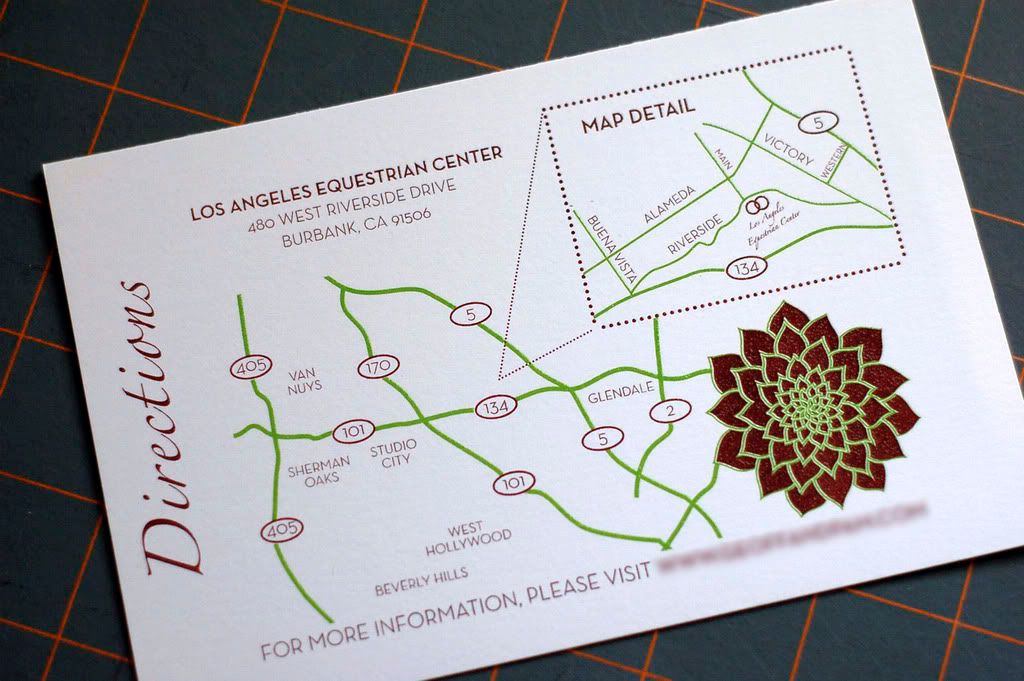
Pam and Geoff were referred to me by the very talented coordinating duo - Jill and Stephanie of Style and Grace Events. When I met them, they told me that their wedding colors were inspired by cymbidium orchids, only in reverse. They wanted burgundy as the dominant color with spring green/chartreuse as an accent color.


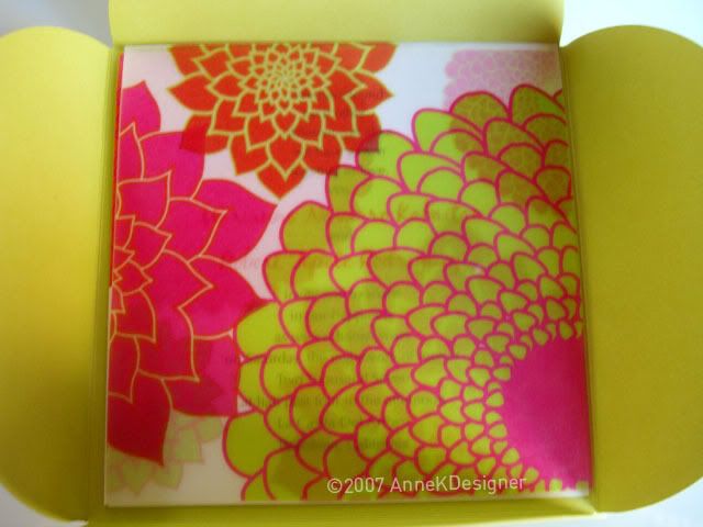
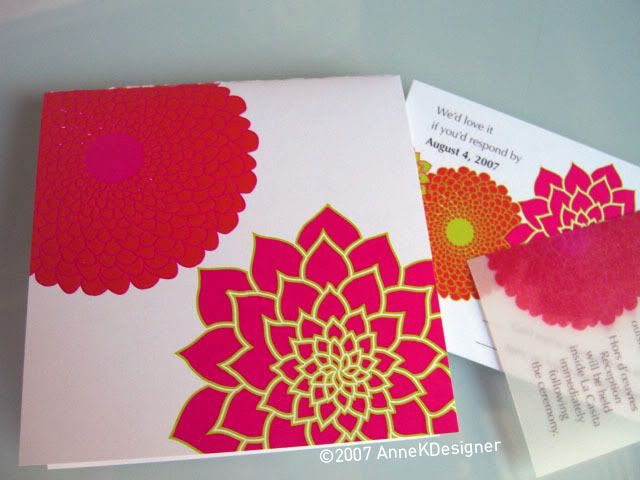
Additionally, they said they really liked the look of the dahlias in my wedding invitations from last year.


Here is what I came up with...

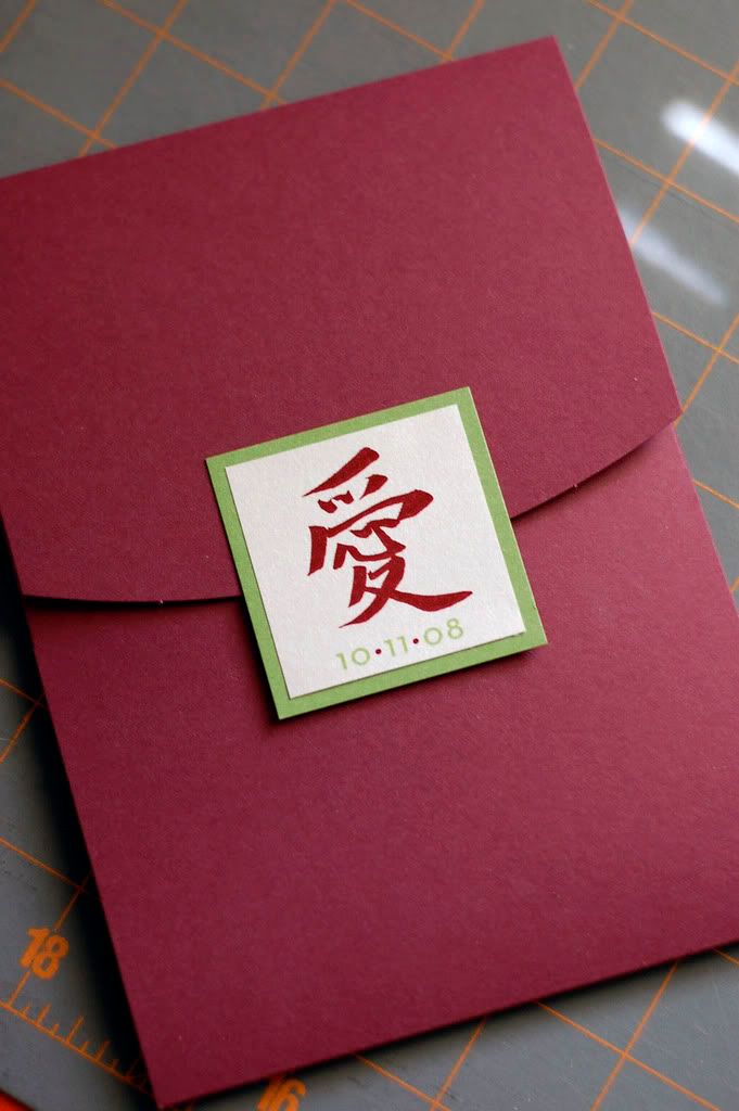
Burgundy Pocketfold with Chinese Symbol for "Love" printed on a Stardream Enclosure

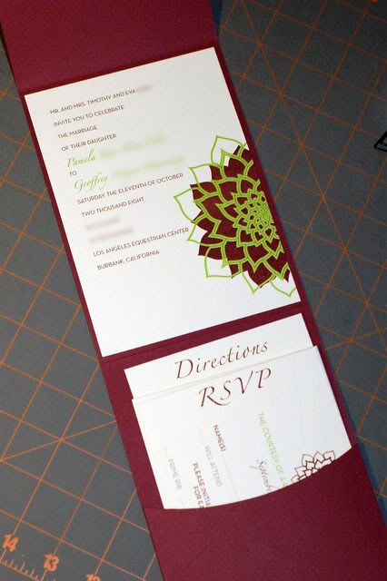
Invitation and Inserts printed with Raised Thermography

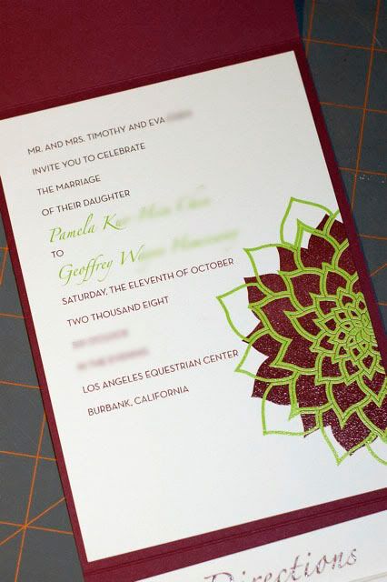
Close-up of Invitation

Close-up of RSVP Card

Close-up of Map Card


Janice & J.D.
I have worked with Janice previously. She had me design bridal shower invites a couple of months back. This time it was a little more exciting because I was working on her wedding invitation suite. The extra challenge for this job was that Janice wanted to Gocco print all of her stationery. I had the very daunting task of creating a design that would translate well for that style of printing.

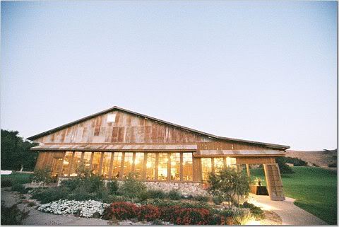
She and her fiance J.D. wanted invitations that evoked the rustic romance of their reception venue, The Firestone Vineyards' Crossroads Estate.

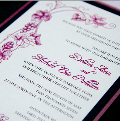
They also sent me these photos as a frame of reference. My apologies for not knowing the origins of these invitations.
{Source Unknown}

They were very much interested in an invitation suite that was a deck of cards.{Source Unknown}

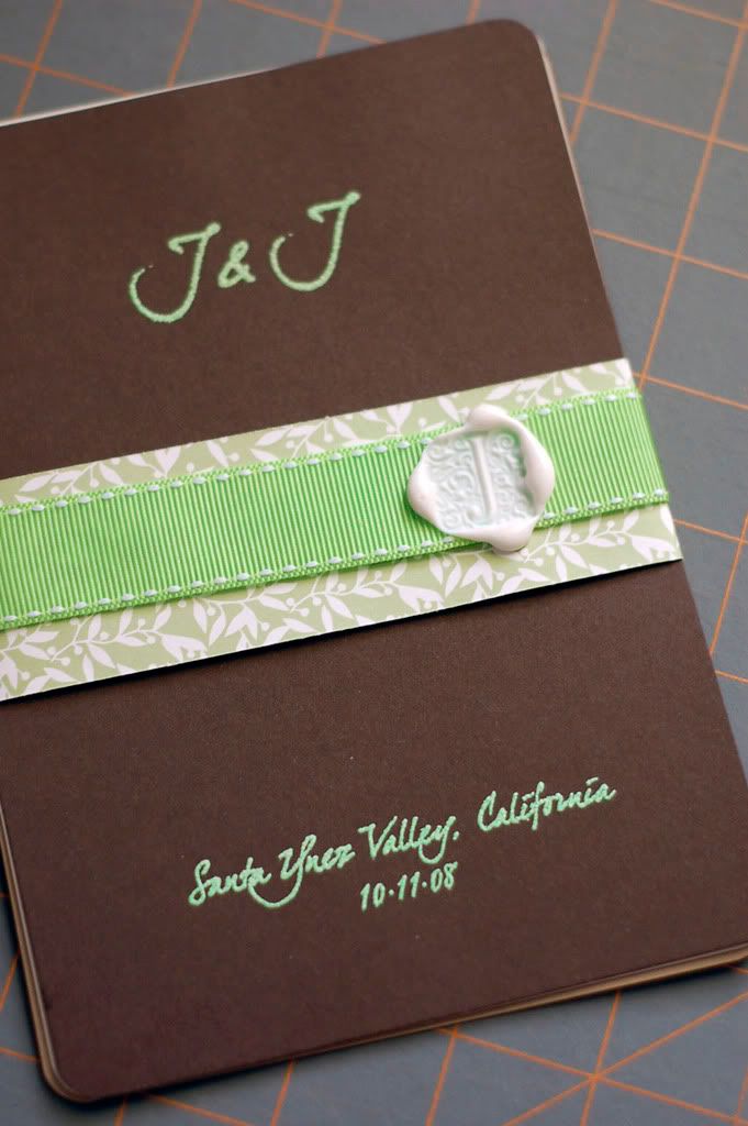
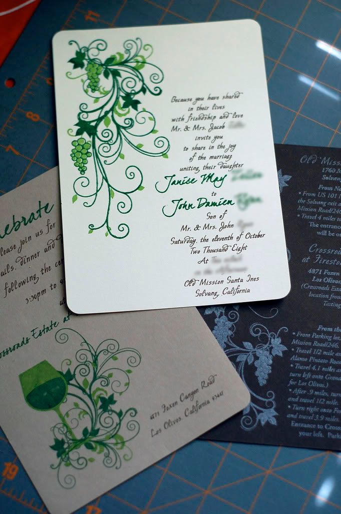
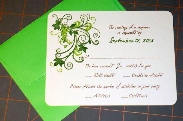
Here is my design coupled with Janice's painstaking printing and invitation assembly. Janice is quite a trooper. She spent over a week Gocco printing these babies. To not leave anyone out, her fiance J.D., rounded the corners of each card and added the wax seals to the belly bands.

Invitation Bundle

Invitation, Reception Card, and Directions Card

RSVP Card and Envelope

Both suites were a lot of fun to work on. I'm looking forward to designing the rest of their wedding paper paraphernalia.

8.04.2008

Little Things Add Up

I have my very fun Sunday to recap and I will get to that a little bit later. I have been remiss in blogging about my design projects. This is not for lack of work. Thankfully, I have been fairly busy. Over the last month, I have been working on 2 invites suites and a plethora of small projects. It's these small projects that have really kept me busy. In the last couple of days, I have delivered 3 of them.

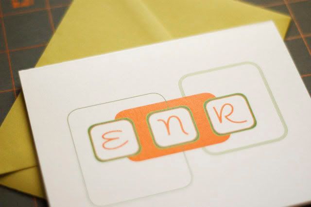
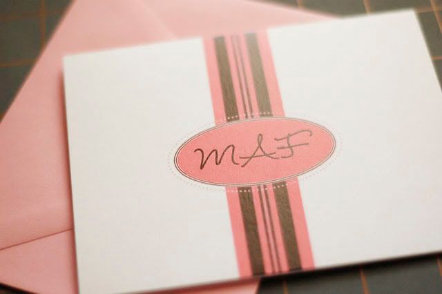
The first of these to be delivered were personalized notecards. These were requested by Melissa. Melissa wanted to give them as gifts for the hostesses of her bridal shower. She described one hostess as funky and the other as a girly girl. This is what I created for her.


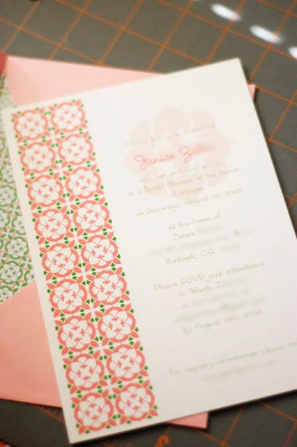
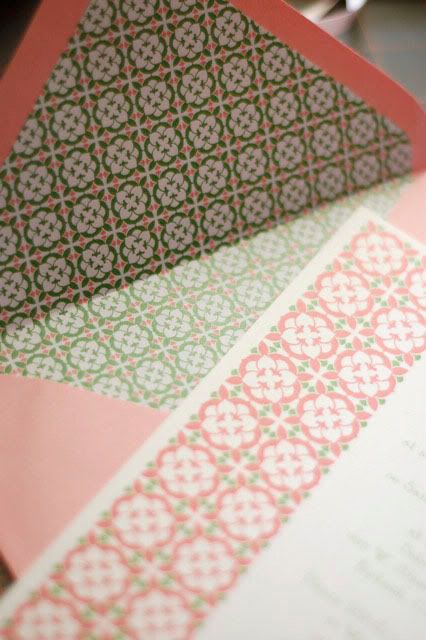
The second project I delivered was for Wendy. She requested Bridal Shower invites for Janice. For this job, I was able to resurrect a design that another client had decided was not in keeping with the style and theme of their wedding. To add a teeny bit of flair, I created a matching envelope liner.


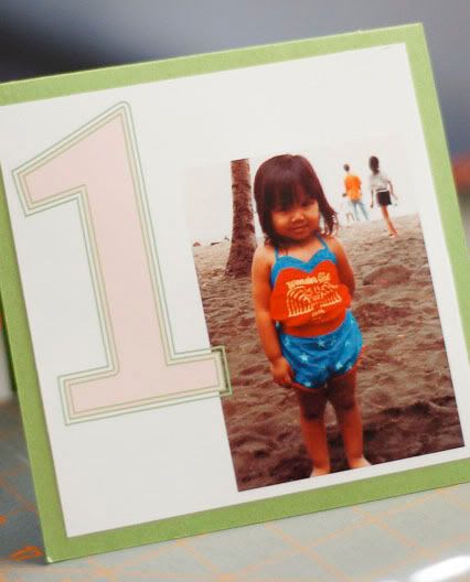
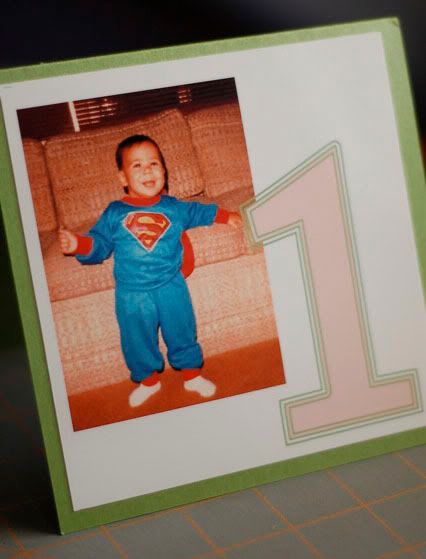
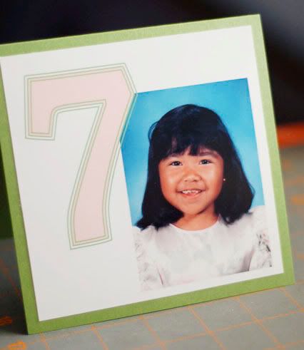
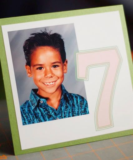
The latest project to be delivered was custom table numbers for Frances. Frances and her fiance Michael wanted to incorporate pictures of themselves growing up as part of their table numbers. Frances emailed her photos to me and I created a simple design. They had a whopping 17 tables! So, this could probably be classified as a medium-sized project. I didn't want to bombard this post with too many photos.


That was a preview of my small projects. I'll be debuting the two invite suites shortly.

7.10.2008

Heartfelt Thanks

Remember these envelopes?
Here are their contents.
I made the cards with my Craft Robo. I finally took it out of the box and set it up . For those that don't know, a Craft Robo is a personal cutter. It works in a fashion similar to that of a printer. Instead of printing on a piece of paper, it cuts out shapes that you designate. I didn't know such things existed. Paola introduced me to this machine last year and I've been pining away for one ever since. I still can't believe that my very generous friends gave me one for my birthday.

I really wanted to show them how much I appreciated the gift. I decided that custom cut thank you cards would be the best route. The cards are a bit simple, but my knowledge of the machine is still fairly basic. Just give me some time. Once I get the hang of that machine, my designs are really going to be elaborate.

Here's a really horrible video of my handy dandy machine in action.
[Video not viewable on RSS feed readers]

Craft Robo in Action from Anne K. Rodriguez on Vimeo.

The video is of my original thank you card idea. I ended up scrapping it for something more personal. My favorite part of the video is Dottie running away. She is not too fond of the noise that the Craft Robo makes while it is cutting. I need to stop torturing my dog with my craft projects.

7.01.2008

Playing catch up

Disclaimer: I actually started this post last week. I didn't get around to posting this because of a family emergency. Don't worry. All is well now.

If idle hands are the devil's instruments, than I should be very close to God right now. I have been toiling on this particular invite suite for over a week. This is one of the largest and most comprehensive projects I've taken on. The order was for 200 invites - designed, printed, assembled and addressed.

Jenny and Kenny - photo by Ellice Schwartz

I met Jenny a few months ago at one of our monthly dinners. Shortly thereafter, she found this blog and asked me to design her wedding invites. She said that she wanted something classic, elegant, and formal. Her colors were gold, ivory and champagne. Her brother had created a monogram for them. Lastly, she didn't want any graphics and minimal color. [Sound of record skipping.] What?! This project was going to be really easy or really difficult.

I treated this design like one of my design projects from Art School. I focused on using classic well-known typefaces. To create visual interest without relying on color or graphics, I decided to use texture as a design element. I used a Stardream paper, handmade paper, and classic linen cardstock.

Here is my finished product.

Invitation Pocketfold


Close-up of belly band and seal featuring monogram designed by Jenny's brother


Overview of Invite Suite


RSVP Card with matching envelope


Custom Map

6.18.2008

Wedding Invitations: Daniella & Josue

Aside from Michael's and Frances' wedding invitation, I have been feverishly working on Daniella's and Josue's wedding invitation.

Daniella is another person that I have meet through the knot. She has always been very sweet and genuine. In order to include as much of their family and friends in their celebration, Daniella and Josue have opted to put themselves on a very strict budget to ensure they could afford to include everyone. Because of this, Daniella had considered DIYing her invitations. I got that sense that she and Josue had their hearts in the right place. Did I mention they met while working at a retirement home? I felt inspired to do something nice for them. I offered to design and assemble her invites for her.

photo by Square Eye Photography

When I first spoke to Daniella about her invitations, she had a few small requests. She wanted me to use her existing monogram, her color scheme of red & black, and a damask pattern.

Here is what I designed for her.


I hope that Daniella & Josue like them as much as I enjoyed making them.
 
The Paper Stylist Diseñado por Wpdesigner y adaptado por Zona Cerebral