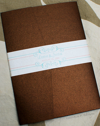


Kanishka decided early on that the rest of her wedding paper accessories would be part of the overall look of her wedding. We worked closely together to ensure that all of her wedding paper accessories would have a cohesive look and feel. Kanishka also wanted to DIY a good portion of the remaining pieces. Much of the remaining pieces were designed to allow for easy printing and assembly. The only element that I assembled were her wedding programs.
Here's a look at my handiwork.
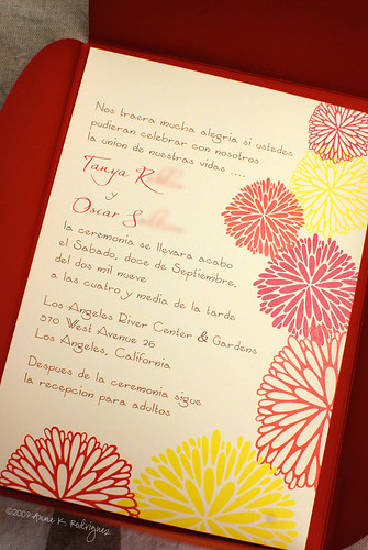
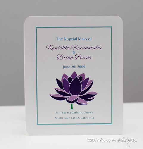
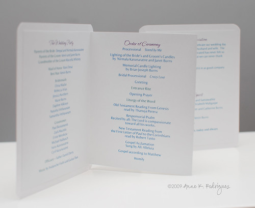
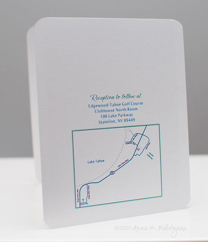
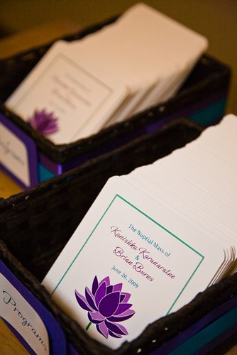
Programs
Here they are at the wedding:
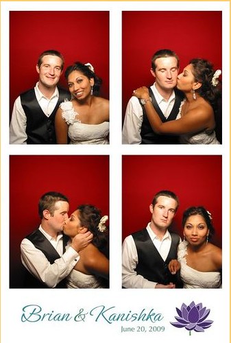
Custom Photobooth banner with their signature lotus flower.
Here's a look at our collaborative effort.
Monograms
I created two monograms, which Kanishka used in a variety of ways. She had a custom stamp made and stamped their monograms on napkins.
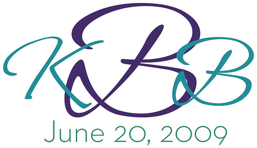
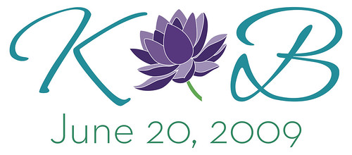

photo by Pix of Life photography
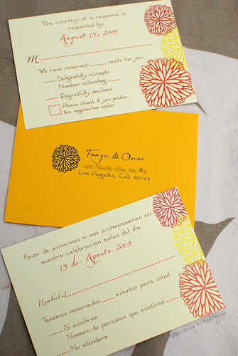
Escort CardsKanishka wanted something simple to assemble, yet unique. I suggested cards inside of mini envelopes. I designed the labels and insert cards and she took care of the rest.

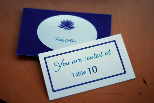
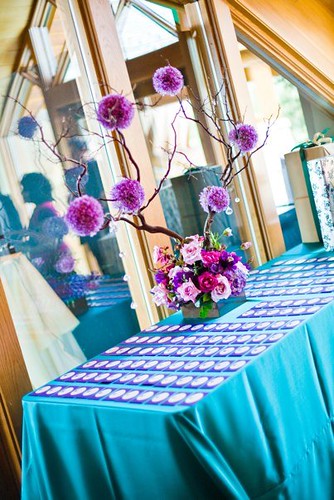
photo by Pix of Life photography
Table Numbers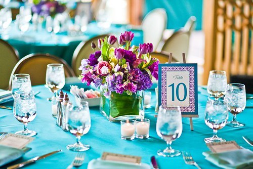
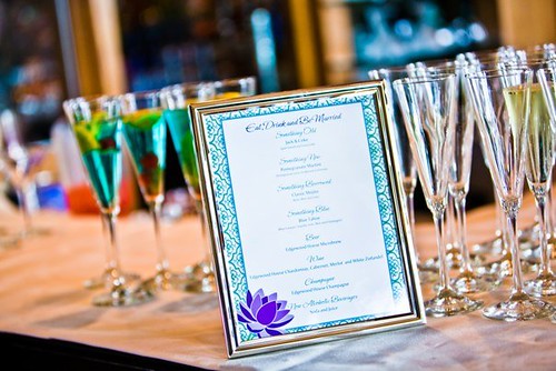
Bar Menu
Kudos to Kanishka for beautifully executing each piece. Her vision and color palette was exquisite. To see more photos of this gorgeous wedding, please visit Pix of Life's blog.