12.12.2008

Save the Dates: Kanishka and Brian

I know, I know. I have been a horrific blogger when it comes to updating this design blog. Thankfully, it's because I've been so busy with design projects that I haven't gotten around to photographing my finished pieces. So, I'm going to do a massive game of catch-up.

When Kanishka and I started discussing her Save the Dates, she said she wanted something modern, yet romantic. She also wanted to introduce her wedding color palette. Other than that, she told me to work my magic.

To give me a better idea of her palette, she sent me this inspiration board from Snippet and Ink.

She also had this inspiration board which she created.
These photos of Leanne Marshall's runway dresses from Project Runway (P.S. Leanne was my fave from this season.)

In addition, they has some amazing engagement pictures taken by Pix of Life.


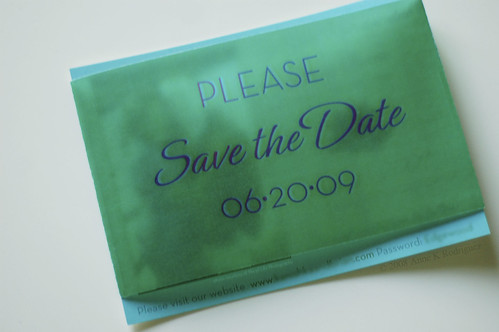
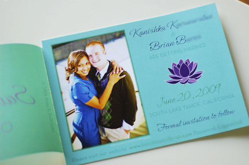
Here's what I came up with:
103_2092-1
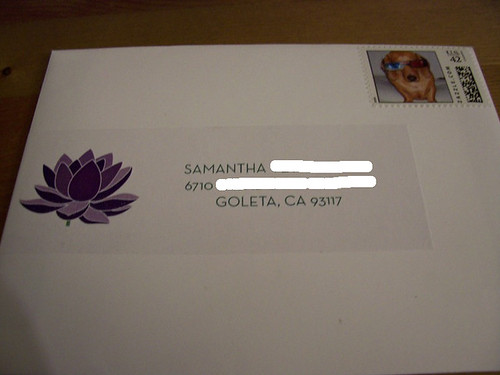
Custom Wrap-Around Label

DSC_1578
Save the Date with Vellum Overlay

DSC_1577
Interior of the Card

I hope they like it. I can't wait to design their wedding invitations. This color palette will be fun to work with.

10.19.2008

Wedding Invitations : Carmela & George

Believe it or not, Carmela is one of my early clients. I first discussed designing her invitations in February of this year! She asked me in February for her December wedding! In the interim months, Carmela and I have become friends. Also over the course of several months, she has forwarded a multitude of ideas for invitations. This particular suite was a collaboration between Carmela and myself. She is definitely a bride who has a specific look and feel for her wedding.

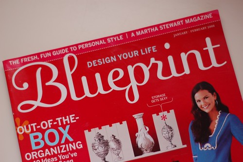
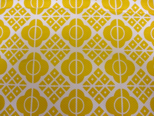
In the end, I used these items as sources of inspiration for Carmela & George's invitations.

Wedding Invitations from Smock Paper

DSC_0742
The no-longer-in-print Blueprint Magazine

Pattern from Carmela's Centerpiece Stand

CIMG1178
Fabric I discovered in the Fashion District

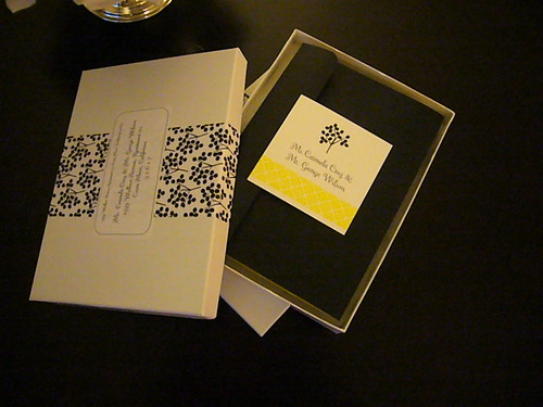
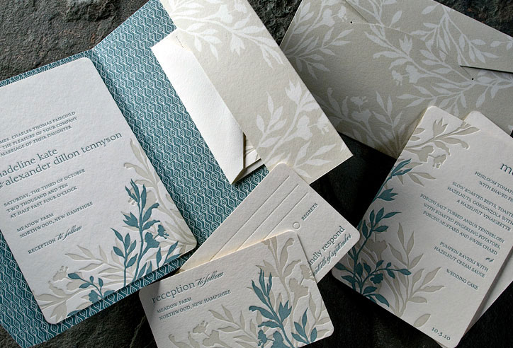
All of these items combined to produce this.....

P1020659
Carmela made the labels and boxed each invitation

DSC_0736
The pocketfold is comprised of printed duplex linen cardstock.
I hand-assembled all 140 pocketfolds!

DSC_0734
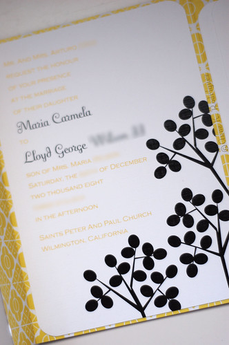
The Main Invitation

DSC_0733
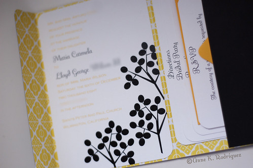
View of Pocketfold Interior

DSC_0732
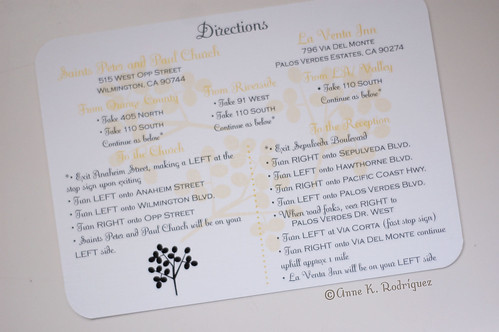
Direction Card

DSC_0731
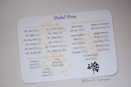
Bridal Party Card, which is traditionally found in Filipino invitations

DSC_0730
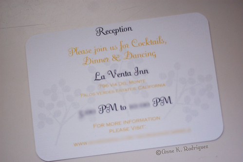
Reception Card

DSC_0729
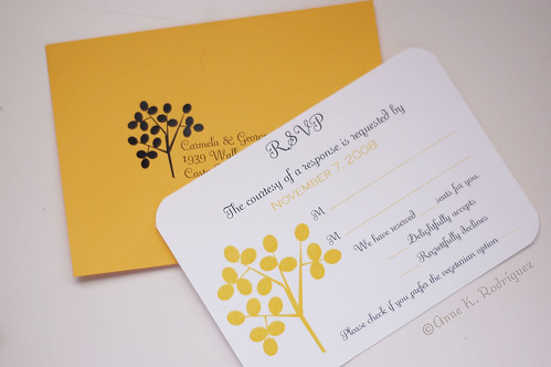
RSVP card and matching envelope

In the end, Carmela and I had a great time collaborating on this suite. I hope her guests will be as excited about them as I am.

10.15.2008

Wedding Paper Accessories: Janice & J.D.

Janice contacted me a few weeks ago to design more items. She and J.D. had successfully printed and assembled the invitations I had designed for them. They were ready to tackle more DIY items. I admire a couple with determination. I happily obliged them and they ran with it.

Janice and J.D. are friends of ours. My husband and I were invited to their celebration. I had the opportunity to see everything firsthand.

Here are photos of my design coupled with their handiwork.

DSC_0759
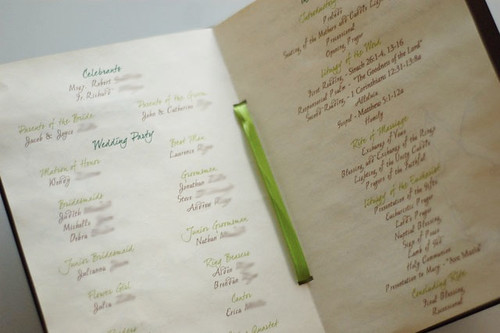
Program Cover
DSC_0766
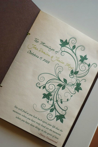
Program Cover Page

DSC_0767
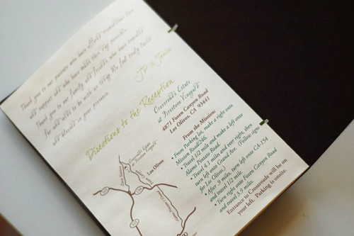
Program Interior

DSC_0768
Last Page of Program

DSC_0721
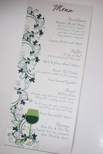
Dinner Menu

DSC_0722
Favor Label

Janice Wedding-48
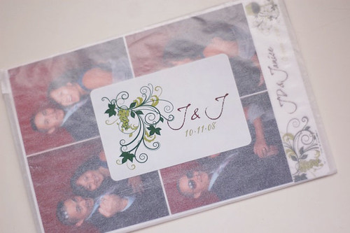
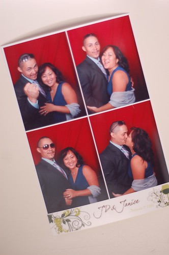
Custom Photobooth Banner


Congratulations to J.D. & Janice! Your wedding was thoughtful and every detail beautifully executed.

10.13.2008

Table Numbers & Programs : Pam & Geoff

I am behind on blogging. Thankfully, it's not because of a lack of work. I am fortunate enough to have been VERY busy the last couple of weeks. Here is the first of several recaps.

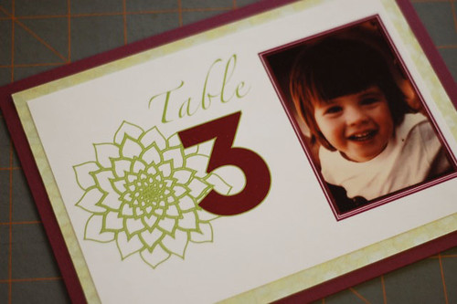
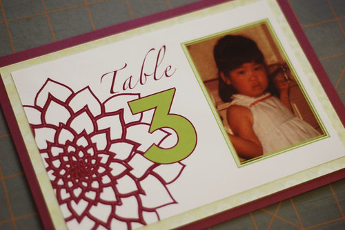
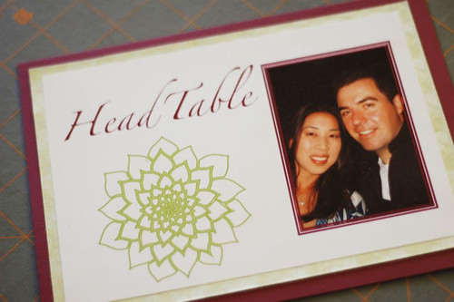
Geoff & Pam contacted me to create Table Numbers and Programs to match the invitations I designed for them a few weeks back. They really wanted table numbers with images of themselves growing up through the years. So, I happily obliged. I incorporated the dahlia art from their invitations. I used a burgundy linen cardstock with Japanese hydrangea paper. Each number was printed on matte photo paper.

Here's a small sample of what they looked like.

DSC_0594

DSC_0593

DSC_0592

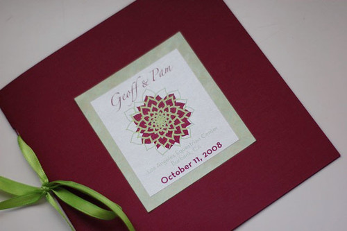
Additionally, they asked me to design and print their programs for them. I designed a simple square-shaped program that was similar to my friend Wendy's Wedding programs. Again, I incorporated a graphic from their invitation on the cover. For these, I used burgundy 30% PWC cardstock, Japanese hydrangea paper, Stardream Opal Text and Classic Linen Text paper.

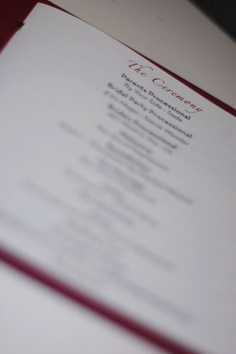
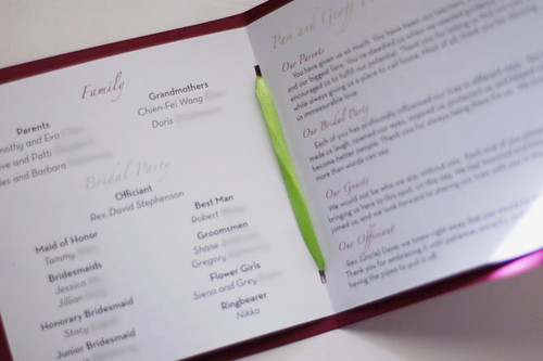
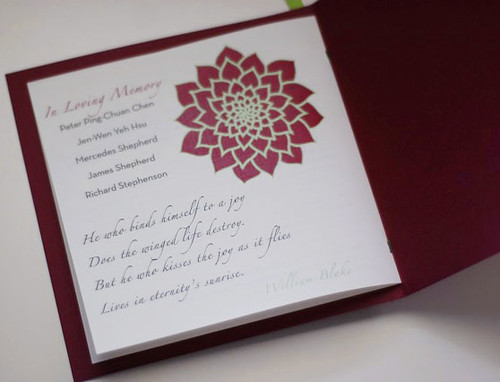
Here's a look at the finish product. The green hydrangea paper is actual much darker in person than in the photographs.
DSC_0717
Cover of the program

DSC_0718
First page

DSC_0719
Interior with Bridal Party and Thank You's

DSC_0720
Memorial Page

Congratulations to Geoff and Pam!

Their wedding was on Saturday. I'm sure the day went beautifully. They were in
good hands. Thanks again to Stephanie & Jill of Style & Grace Events for referring such amazing clients to me.

9.17.2008

Wedding Invitation Flashback

To give myself a sense of accomplishment and to make it easy to find my previous invitation designs, here's a rundown of my wedding invitations from the last six months.

1. Wendy and Lior's Wedding Invitation Suite, click here.

2. Aileen and Scott's Wedding Invitation Suite, click here.


3. Daniella & Josue's Invitation Suite, click here.
4. Jenny and Kenny's Invitation Suite, click here.
5. & 6. Janice & JD and Pam & Geoff's Invitation Suites, click here.


To all the couples whose wedding invitations I've worked on in the last 6 months, thanks for giving this designer so many opportunities to explore my creativity.

9.14.2008

Table Numbers & Escort Cards: Jenny & Kenny

Jenny had fully intended on DIYing her own table number and escort cards. However, an extremely demanding work schedule put a halt to that idea. Because I had designed Jenny and Kenny's invites, she contacted me to help her by designing and assembling these items for her. Her only instructions were that she wanted to do something other than table tents and it had to have some kind of "wow" factor. Otherwise, my imagination had free reign.

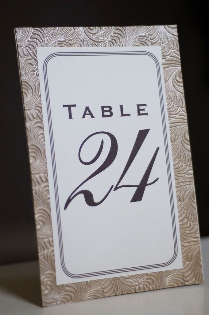
I had some textured gold paper leftover from their invites. (I am guilty of constantly ordering far more materials than I actually need.) Here is a sample of the table numbers I created.

For her escort cards, Jenny had toyed with the idea of using little envelopes with each person name on it. The practicality of that was a bit daunting because she needed 155 escort cards! So, I worked with that general idea. Here's what I designed and assembled for her.
Each pochette was attached to ribbons that ran along the width of her escort card table

Close-up of Pochette

Opened with Table Assignment

Thank You Card : Paul & Kelly

Kelly contacted me after finding my blog. She and her fiance had already sent their wedding invitations. So, she couldn't hire me to create that particular item for them. Instead, she decided that she wanted custom Thank You cards. Kelly was very thorough and specific about the look they were going for.

Here some of the images and commentary she gave me for design direction.

We prefer the Japanese Zen feel of something modern and clean but also bold, wispy, romantic and soft. Although a lot of times bamboo is portrayed as big stalks with some pointy leaves, bamboo is really a grass and it has a lot of movement in the wind and is very graceful. Some images that are modern and have a soft wispy feel are also attached to give you some inspiration and ideas hopefully. Our wedding colors are lavender, sage green and some deep purple (bridesmaid dresses and rehearsal dinner invitation).

{Source Unknown}
This is labeled non-preferred bamboo. This is because it reminds me of stereotypical Chinese/Asian/Polynesian bamboo especially with the placement of the double happiness image and all. It has an exotic "oriental" feel.

After a few rounds of correction, this is the finished product.

Thank You Card with matching light green envelope

I hope that Kelly and Paul enjoy writing their thank you notes on these cards. From the sounds of things, they have quite a few to write. They ordered 180 of these bad boys!

9.13.2008

An Introduction


For as long as I can remember, I have had an infatuation with paper. When I was kid, my mom used to bring home stacks and stacks of computer paper. This was the 80s when computer paper came in long perforated stacks. Give me a stack of paper and a new box of crayons and I was a happy camper.
This love affair with paper manifested in high school as fanciful collages made from magazine cutouts and wrapping paper and monumental stacks of black and white photos. In college, I discovered graphic design by way of an artist boyfriend. After that, I switched my major from pre-physical therapy to graphic design much to the chagrin of my parents. The learning process fueled my creativity past college. So, I continued to create things. I made cards, designed handmade books, fashioned origami, and whatever else the mood inspired. My favorite thing to do was custom stationery for friends and family. I made wedding invitations for my friend's wedding and baby announcements for another friend's baby. I did various small projects like this for years. It was something that I did "on the side". Five months ago, my day job quit me. Then, the thing that I did "on the side" became something I simply "did".

This blog is for my creative endeavors . I thought it was about time to separate my creative projects from my personal life. I can't promise that everything I post will be unbelievably incredible. However, I'll do my best to make it interesting.
 
The Paper Stylist Diseñado por Wpdesigner y adaptado por Zona Cerebral